
Guide to Responsive Images for Freelance Web Developers
 by Shanie Goodwin
Learn how responsive images can improve your web projects and boost your freelance career. This guide covers essentials for beginners, from basics to implementation, helping you create adaptable designs that work on any device.
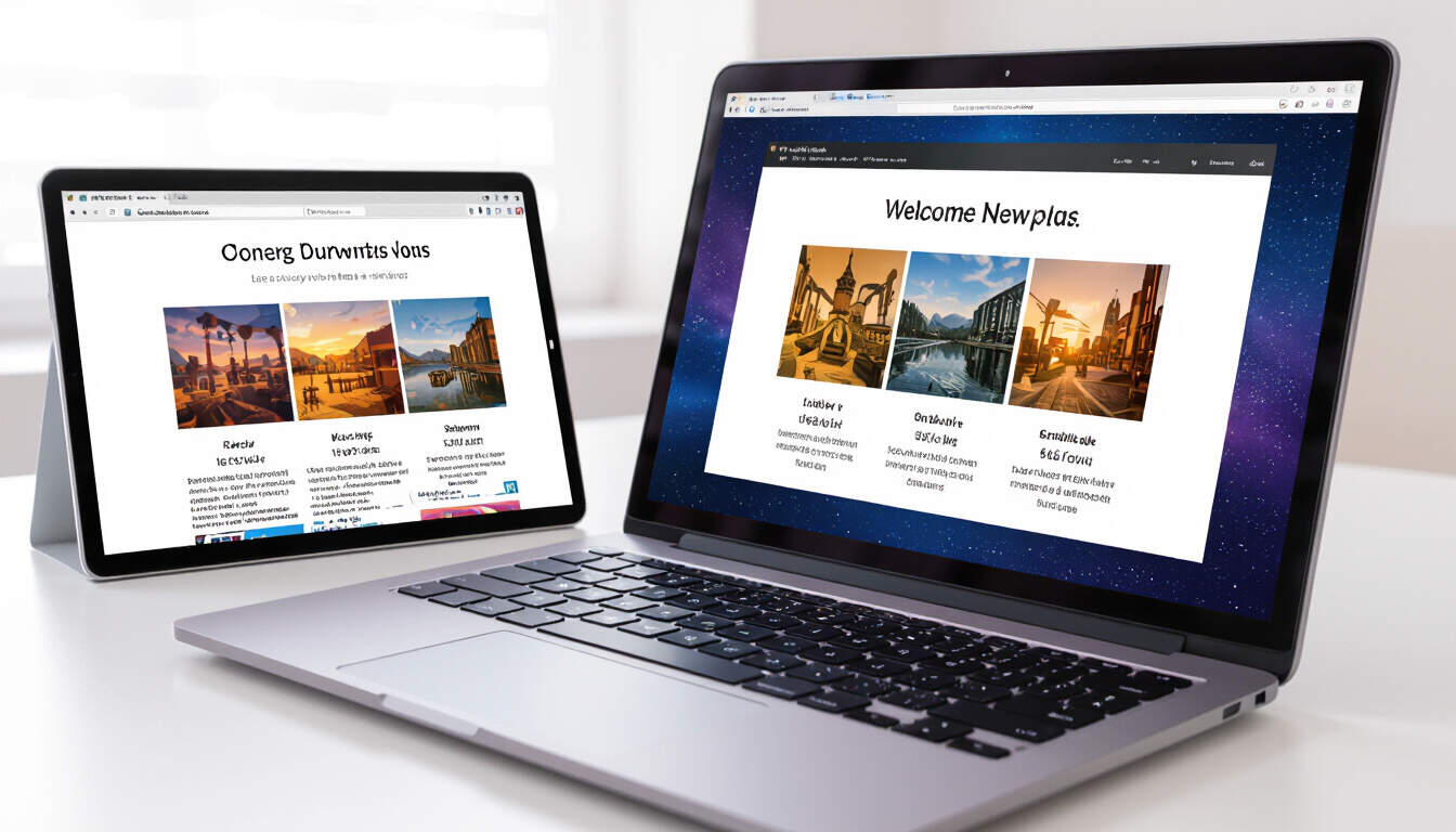
Starting as a freelance web developer means building skills that make your work stand out. One key area is handling images effectively. Responsive images ensure that visuals look good on all devices, from desktops to smartphones. This approach helps create websites that perform well and keep users engaged.
Why Responsive Images Matter
In web development, images often take up significant space and can slow down sites if not managed properly. Responsive images adapt to different screen sizes, reducing load times and improving user experience. For freelancers, this skill can lead to better client satisfaction and more repeat business.
Consider a portfolio site you might build. If images don't resize automatically, visitors on mobile devices could face frustration. By using techniques like srcset and sizes attributes in HTML, you control how images display. This method keeps your projects efficient and professional.
Getting Started with Responsive Images
To begin, understand the basic tools. HTML and CSS form the foundation. For instance, the img element with srcset lets you provide multiple image sources. A simple example might look like this in code:
<img src="image.jpg" srcset="image-small.jpg 480w, image-medium.jpg 800w, image-large.jpg 1200w" sizes="(max-width: 600px) 480px, 800px" alt="Description here">
This setup allows browsers to select the right image based on the device's viewport. As a beginner, practice this in your projects to see immediate results.
Image optimization is another step. Tools like image compressors reduce file sizes without losing quality. Options such as TinyPNG or online editors help here. Once optimized, your images load faster, which is crucial for freelance work where clients value speed.
Implementing in Your Workflow
When working on client projects, integrate responsive images early. Start by assessing the project's needs. Do the images need to scale for various devices? Use CSS media queries to adjust layouts. For example:
img {
  max-width: 100%;
  height: auto;
}

@media (min-width: 768px) {
  img {
    width: 50%;
  }
}
This code ensures images flex with the design. As an intermediate learner, experiment with these in your portfolio to showcase your abilities.
Freelancers often handle diverse projects, from e-commerce sites to blogs. In each case, mobile-friendly design becomes essential. Statistics show that a large portion of web traffic comes from mobile users, so adapting images can set you apart from competitors.
Best Practices for Freelancers
Focus on testing your work. Use browser developer tools to simulate different devices. Check how images behave on various screens to catch issues early. This practice builds confidence and helps deliver high-quality results.
Collaboration tools can aid here. Share prototypes with clients for feedback, ensuring the final product meets expectations. Over time, this leads to stronger portfolios and more opportunities.
Another tip is to stay updated with web standards. Resources like MDN Web Docs offer clear guidance on new features. By incorporating these, you enhance your skills and attract clients seeking modern solutions.
Building a Career with These Skills
As you grow as a freelance web developer, responsive images become part of a larger toolkit. Combine this with other areas like accessibility and performance to offer comprehensive services. Clients appreciate developers who deliver sites that work seamlessly across devices.
Networking through platforms can connect you with potential clients. Highlight your expertise in responsive techniques in your profiles. This positions you as a reliable professional ready for real-world challenges.
Remember, consistent practice turns knowledge into expertise. Start small, build projects, and refine your approach. The more you apply these concepts, the more you'll enjoy the freedom of freelancing.
In summary, mastering responsive images opens doors in web development. It improves site performance and supports a sustainable freelance career. With dedication, you'll create work that resonates with users and clients alike.