
Building Responsive Websites for Freelance Success
 by Shanie Goodwin
Discover the essentials of creating responsive websites, a key skill for aspiring freelance web developers. Learn practical steps to ensure your sites work seamlessly on all devices, helping you build a thriving freelance career.
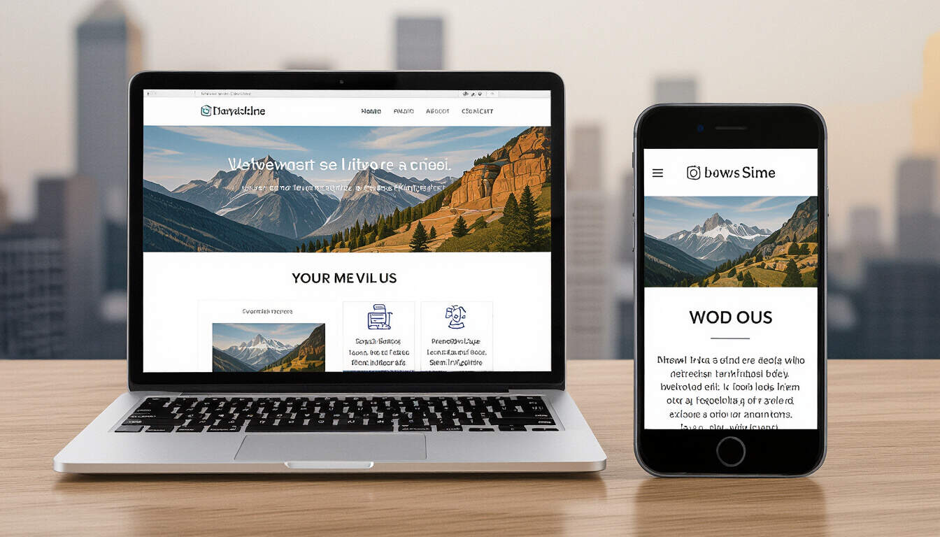
Many people entering web development find that building responsive websites is a fundamental skill. Responsive websites adapt to different screen sizes, making them essential for modern users. This approach ensures content looks good on phones, tablets, and desktops.
Why Responsive Websites Matter in Freelancing
Creating responsive websites can open doors to more clients. As a freelance web developer, you will often work on projects that require sites to function across devices. This skill helps deliver projects that meet user expectations and improves client satisfaction.
For beginners, starting with responsive design basics builds a strong foundation. You might begin by learning how to use CSS for layout adjustments. This technique allows elements to resize and rearrange based on the device.
Getting Started with the Basics
To build your first responsive website, focus on core technologies. HTML provides the structure, while CSS handles the styling. JavaScript adds interactivity, but keep it simple at first.
One effective method is using media queries in CSS. These rules let you apply styles based on screen width. For example, you can set different layouts for mobile views. This practice is straightforward and helps avoid common pitfalls.
As an intermediate learner, consider experimenting with frameworks. Tools like Bootstrap offer pre-built components that are already responsive. They save time and provide a consistent look across devices.
Step-by-Step Guide to Building One
Follow these steps to create a responsive website from scratch.
First, plan your layout. Sketch a basic wireframe on paper or use design tools. Think about how elements will stack on smaller screens.
Next, set up your project files. Create an HTML file for content and a CSS file for styles. Add a meta tag in HTML to ensure proper scaling on mobile devices.
Then, implement flexible grids. Use CSS Flexbox or Grid to arrange elements. This system allows items to adjust automatically, which is crucial for websites viewed on various devices.
Test your work early and often. Use browser tools to simulate different screen sizes. Check how your site looks on both portrait and landscape modes.
Finally, optimize images and performance. Compress files to load quickly on mobile networks. This step enhances user experience and can lead to better freelance opportunities.
Essential Skills for Freelance Web Developers
Beyond building responsive websites, develop a range of abilities. Strong problem-solving skills help debug issues quickly. Communication is key when working with clients to understand their needs.
Learning about accessibility is also important. Ensure your sites are usable for everyone, including those with disabilities. This includes using proper contrast and semantic HTML.
Pricing your services appropriately is another aspect. As a freelancer, you need to value your time and expertise. Research market rates to set competitive prices.
Overcoming Common Challenges
Every developer faces obstacles when building responsive websites. For instance, handling different browser behaviors can be tricky. Test on multiple browsers to identify and fix issues.
Time management is vital in freelancing. Break projects into smaller tasks and set deadlines. This habit keeps you organized and helps deliver work on time.
Seek feedback from peers or online communities. Sharing your work can provide valuable insights and improve your skills. Over time, this practice will make you more confident in your abilities.
Tools and Resources to Use
Several tools can aid in development. Code editors like Visual Studio Code offer helpful features for writing code. They include extensions for CSS and HTML that speed up the process.
Online platforms provide tutorials and courses. Sites like freeCodeCamp or MDN Web Docs have sections on responsive design. Practice with their exercises to reinforce what you learn.
Version control systems, such as Git, are useful for tracking changes. This tool is especially helpful when working on larger projects as a freelancer.
Turning Skills into a Career
Once you are comfortable building responsive websites, start seeking freelance gigs. Create a portfolio to showcase your work. Include examples of sites you have built and the challenges you solved.
Network with potential clients through social media or professional groups. Attend virtual events to connect with others in the field. These steps can lead to your first paid projects.
Remember, growth comes with experience. Keep practicing and updating your skills. As a freelance web developer, continuous learning will keep you competitive in the market.
In summary, building responsive websites is a rewarding pursuit. It equips you with practical skills for a successful freelancing career. With dedication and practice, you can achieve your goals in web development.